Choosing between kraft and white paper straws feels like a simple choice between a "natural" and a "clean" look. But for a branded straw, the real decision is about which background makes your logo look professional-and which one might make your branding investment disappear into the background. A request for "printed straws" tells a supplier the product, but not the logo’s colors, which is the detail that decides whether kraft or white is the better canvas.
Many buyers assume a plain kraft straw’s lower price means a cheaper final product. The surprise often comes after the quote, when they learn that printing their bright, colorful logo on a brown background may require an extra step that can make it more expensive than printing on a white one.
The right choice between kraft and white paper straws depends on your brand’s aesthetic, your logo’s design, and the final look you want to achieve. For best results, consider the contrast and color vibrancy of your logo on a brown vs. a white background, and decide which style-rustic or clean-best aligns with your customer experience.
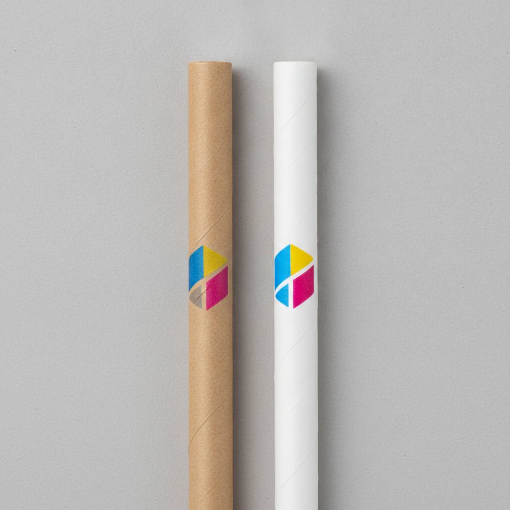
Think of the straw’s surface as the canvas for your logo. The background color-brown or white-directly affects the contrast and vibrancy of your branding. The decision is less about the straw material and more about how that canvas works with your specific logo and brand identity.
The decision between kraft and white is primarily about brand alignment. Each color sends a different message and works best with a different brand aesthetic.
A buyer’s preference for "kraft" tells a supplier their desired aesthetic, but not whether they have considered how a brown straw will look inside their main beverages. A brown straw can look great in a light-colored latte but might get visually lost in a dark cola.
This is where many buyers make an incorrect assumption. Printing on a brown background is not the same as printing on white paper. The key factors to check are contrast and color vibrancy.
A simple, dark-colored logo (like black or dark brown) often has enough contrast to be legible on a kraft straw. However, if your logo includes:
These elements can appear dull, "muddy," or lose their intended shade when printed directly onto a brown background.
To achieve better vibrancy, a supplier may need to print a layer of white ink as a base coat before printing your logo’s colors on top. This "white ink underbase" is an extra printing step that adds to the final cost. A low quote for a printed kraft straw may not include this step, leading to a disappointing sample.
If a supplier gives you an instant price for a printed kraft straw without seeing your logo first, their quotation is not ready for a serious comparison.
A common misconception is that one color is stronger or more durable than the other. However, a straw’s performance is not determined by its color. The factors that affect resistance to soaking and rigidity are independent of color:
1. Paper Grammage (GSM): The weight and thickness of the paper used. 2. Number of Paper Layers: Most straws use 3 or 4 layers (plys). 3. Adhesive Quality: The glue that bonds the layers together. You should confirm this adhesive meets the food-contact standards for your market.
When requesting quotes, you should confirm the supplier is quoting for the same specifications (e.g., 3-ply, 120 GSM paper) for both the kraft and white options. This allows you to make a true, like-for-like comparison. You should expect both kraft and white straws from the same supplier to have similar performance when made with the same paper grammage, number of layers, and adhesive quality.
Use this checklist to move beyond a simple color preference and make a structured business decision. This helps clarify your needs before you contact a supplier.
| Decision Factor | What to Ask Your Team | Buyer Check |
|---|---|---|
| Brand Alignment | Does our brand have a rustic/natural aesthetic or a clean/modern/vibrant one? | Kraft often fits rustic themes; white is more versatile for modern or premium brands. |
| Logo Contrast | Is our logo simple and dark, or does it have light colors, pastels, or fine details? | Dark logos work on kraft. Light or complex logos are safer on white. |
| Color Accuracy | Are the specific Pantone shades in our brand guidelines important to reproduce? | If yes, a white background provides more accurate and predictable color reproduction. |
| Mock-up Review | Have we seen a digital mock-up of our logo on both kraft and white backgrounds? | This is a simple, no-cost check that can prevent major surprises. |
| Use-Case Check | How will the straw color look in our most popular drinks (e.g., dark soda, colorful smoothie)? | Place a sample of each in your actual drinks to check the final customer presentation. |
| Final Cost Comparison | Are we comparing the total cost of the final, printed straw for both options? | Ask if the kraft quote includes a white ink base if your logo needs it. The cheaper plain straw may not be the cheaper final product. |
To avoid surprises and get a quote you can actually compare, you need to provide the right information. The goal is to compare the final, all-in cost for a finished product that meets your brand standards.
The cheaper plain kraft straw is not automatically the more cost-effective choice for a branded product. The real problem is that buyers compare base material prices before knowing if their logo’s colors will require a more expensive printing process on the kraft material to be visible.
If a physical printed sample isn’t practical due to time or cost, ask the supplier for a detailed digital mock-up showing your exact logo on both a kraft and white background texture. This is a practical check before committing to an order.
To get a useful and comparable quote for branded paper straws, please prepare the following information for your inquiry:
With these details, a supplier can provide a useful recommendation based on your specific artwork and brand needs. This allows you to compare the final, all-in cost for each option and make an informed decision.